As a final project for my digital communications class, I will design a website. First, I need a plan. This is what I have decided about my strategy and scope:
Strategy
My digital portfolio will be an explanation of me. I want to show employers the site. I am applying for internships for Spring and Summer. I need to show all of the skills I have learned this semester. Employers will see that I am comfortable and capable with digital media. I am not sure how to give employers my link. Possibly I will add it to my resume. Also, I want to brand myself to make my applications and interviews more memorable.
Scope
I will include as many features as possible to teach employers about myself. I will have social media widgets linked to my Facebook and, possibly, Instagram, as well as a contact form. I will include my resume, experience (internships with photos), skills (especially those learned in Digi Comm), and, on another page, writing samples, video samples, and photography samples. Also, I’ll include the samples of inspiration found below. In my ‘more’ section, I might include fun facts. I am a camp counselor in Africa and I have lots of photos from my travels. My resume has my address on it… is that ok? It’s my school PMB box, so I think it is.
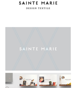
Inspiration:
Branding
Minimal
Color (and lack thereof)
Photographic background
Elegant portfolio layout
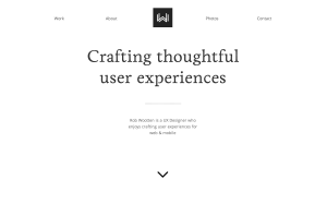
I’ve started working on my site. Check it out. I’m still adding to it, but the ‘portfolio’ page is almost finished.
Key to generating positive user experience (as discussed in my last post) is writing, or producing, for the audience. Chapter two of Janice Redish’s Letting Go of the Words: Writing web Content that Works helps us understand who exactly our audience is, so that we can write specifically for them. Redish says a web author must:
List your major audiences
Gather information about your audiences
List major characteristics for each audience
Gather your audiences’ questions, tasks, and stories
Use your information to create personas
Include the persona’s goals and tasks
Use your information to write scenarios for your site
Numbers 1-4 on this list are fairly self-explanatory, but she lost me at 5. She explains that “a persona is an individual with a name, a picture, and specific demographic and other characteristics” (19). Creating these personas is also a technique used in marketing and business. Here is an examples of personas created for phone marketing:
Web writers must create similar personas in order to better understand their target audiences. Redish says that web-writers’ audience personas should include:
key phrases or quotes
experience, expertise
emotions
values
technology
social and cultural environments
demographics (age, ability, and so on)
Also, the personas should include pictures and names. The writer should be able to understand and feel a connection to the audience. Because the internet has made audiences so large, and then demassified them, this process is key. After creating the personas, the writer can design web content based on them. The writer can ask questions of the persona and apply the answers to site design. “Everything on your web site should relate to at least one scenario that a real user might have for coming to the site” (27). The personas temporarily fill in for real users, and help make the website more concise and productive.
Chapters one and two of Jesse James Garrett’s The Elements of User Experience explain the importance of user experience and how to achieve it. On page eight, Garrett explains how different aspects of design all work together:
[Aesthetic Design + Functional Design]User Experience Design* = User Experience
*User Experience Design “makes sure the aesthetic and functional aspects of the button work in the context of the rest of the product” (Garrett 8).
User experience concerns everything that is made for human use, not just websites. However, the final project for my Digital Communications class is a website, so I think it is appropriate to discuss website user experience in this post.
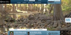
Two of the most common examples of good and poor user experiences in my life are the websites of the two banks I use. The site of my bank in Texas, Frost Bank, is easy to use and very aesthetically pleasing. Each day, they post a beautiful photo taken by a customer and focused on the state of Texas. I have never had a hard time using the site. On the other hand, CitiCards changes the photo on their cover page maybe once every six months, and the photo usually looks as if it was taken some time in the 1990s.
At first glance, you may not think the Citicards site looks that bad, but it is. For example, it takes 3 different log-ins to get a virtual account number for online purchases. Frost is secure, but doesn’t impose on the user in such ways.
The Citicards site could use design help on each of Garrett’s Five Planes:
Surface Plane: initial images and text
Skeleton Plane: placement of surface buttons, controls, and text
Structure Plane: the abstract build-up that the skeleton plane reflects
Scope Plane: all of the features and functions the structure provides
Strategy Plane: how the scope accomplishes the purpose of the site
The Citicards site doesn’t accomplish the flow required between these planes. It is disjointed, making it hard for the user to know where to go next and displeasing and incoherent aesthetically. Why is the photo two beautiful people on the beach? I know why the Frost photo is there, because I am a Texan (like most Frost clients), and it successfully ignites nostalgia within me.
Chapter six of Brian Carroll’s Writing for Digital Media, titled ‘Online Editing, Designing, and Publishing’, discusses the transformation that editorial positions have undergone. The photo above portrays the classic role of an editor. Today, the role of the editor has been obscured with the rise of digital media.
Ok, how?
Rather than reading and editing articles that journalists compose, today, editors must be able to perform a variety of functions. They design web content, which means they must make the traditional content appear aesthetically pleasing and clear to the digital reader. An online editor has many jobs and many responsibilities.
Steps to Online Editing:
Identify readers/audience and the purpose of the content
Define document structure and links
Define the style
Edit
Copyedit
Copyedit II
Write headlines
Test usability
These steps are important and complex because, unlike with print media, digital writing must be easy to scan and be non-linear. This lends digital writing to be a type of multimedia storytelling that has become its own field.
I think it’s interesting to be reminded that writing headlines is a last step in editing. A headline needs to portray accurately the content of the piece, so writing it before the body just doesn’t make sense.
What specific skills must the digital editor have?
Hyperlinking alone has been monumental to writers. This enables readers to jump from one page to another, at exactly the time and to exactly the place that the writer designates. Editors must be able to use this and other techniques to keep the reader engaged, and, well, reading.
How has the act of copyediting transformed with digital writing?
Copyediting, also, is more complex: “Online copyediting also involves checking consistency in visual design, testing links and ensuring accurate reading…this copyediting function should include inspecting naming conventions for individual pages, folders and sections” (122). These are things that a print editor would never have had to do.
It’s a great example of POV shots because the cameras on the soldiers’ helmets are often used during combat scenes. The shots transport the viewer into the battle so well that the the chaos and danger feel tangible.
Another type of POV is the second-person shot. The difference lies in who it is addressing. Instead of saying “This is what I am experiencing”, as a first-person POV does, a second-person shot addresses the audience and directs “you”.
Third person point of view is used when a story is told from the observer perspective. Restrepo uses first, second, and third point of view to immerse the viewer in the action and into the psyche of a soldier.
But what is Restrepo attempting to tell the audience by adopting these points of view?
Douglass and Harden say “We involve ourselves in propaganda whenever we undertake a fiction or nonfiction production with the major purpose of convincing our audience of a particular set of principles, beliefs, or opinions”. I have watched Restrepo several times, and I am still trying to understand its message.
Because it is about war, I originally thought the documentary has a political attitude. But I realized that it portrays both American political parties as equally valid. The horrible conditions that the soldiers must endure represent a Democratic stance on war, while the voices of the soldiers themselves provide evidence for the Republican perspective.
Now, I believe Restrepo tells a story of human emotion, struggle, and triumph. It is about what it means to be human, rather than the war. Go and watch it on Netflix!
Osgood and Hinshaw’s chapter eight from Visual Storytelling: Videography and Post Production in the Digital Age, titled ‘The Aesthetics of Editing’ teaches the importance of the post production process. Editors have the difficult job of editing a production so well that it lives up to its entire potential, while making their editing so unnoticeable that the film seems organic and real. Deciding when and how long a shot is placed takes skill and intuition, and b-roll can either enhance or detract from a production. Sequence and timing are key, and there is not always a formula to follow.
For my Digital Communications class, I am working on a video about boutique fitness franchises, so I am excited to learn more about video editing. I think that as an amateur editor, establishing continuity will be one of my greatest challenges.
Osgood and Hinshaw describe two types of continuity in production:
Physical continuity: which relates to items such as props used in production. It’s important that the ‘things’ stay consistent, so as to create a realness and believability about the film.
Technical continuity: has to do with the action of recording the shot itself, visually, and audibly. Light and sound changes make it difficult for the viewer to understand sequences of events.
There are other ways, other than physically and technically, that continuity can be broken. A spatial jump cut happens when two clips that are next two each other sequentially are too similar. This gives the appearance of a mistake during filming.
Part of an editor’s job is to correct any continuity mistakes made when filming. A cut on action is two shots, one after the other, that do a good job of portraying whatever plot movement is occurring. One convention editors use to create continuity is maintaining screen direction. This means that all shots should be taken from the same side on an imaginary axis on the screen.
In chapter seven of Sight, Sound, Motion, Herbert Zettl explains the attachment ingrained within us towards horizontal and vertical lines. Here are some words Zettl says that we associate with orientations:
Horizontal: calmness, tranquility, and rest
Vertical: dynamic, powerful, and exciting
We are so attached to these directions that we have an uncanny ability to detect even the slightest variation from exactly horizontal or exactly vertical. We can tell, even on a blank, large wall, when a photo frame is tilted. I have experienced my own reactions to tilted axes in an IMAX movie theater. The simulation of barrel-rolling through the air in a fighter jet, all part of the movie, actually made me feel motion-sickness.
This is one of the reasons we feel so fascinated by the leaning Tower of Pisa. It just looks wrong. Yes, the physics are interesting, but one doesn’t need to understand the physics to realize that something about the tower is not what it should be. In the photo above, the horizon is pictured horizontally, further exaggerating the lean of the tower. We are amazed by it because it is so opposite of our norm.
In addition to magnetism of frame and other characteristics, Zettl explains screen-left and screen-right asymmetry. I remember talking about this when our class discussed online news web-page layouts. We learned that our attention is generally focused on the upper right-hand side of the screen, and then moves from that quadrant.
Zettl provides on page 111 a photo of a woman holding a first aid kit level with her face and to her left, and an inverted version of that same photo. In each version of the photo, I focus on the object to the right, whether that is her face or the kit.
Placement on the screen is a powerful tool for media composers. Understanding axes and the asymmetrical tendencies of the brain help them know where to put important content.
In part 3 of Open Sky, Paul Virilio describes how the infiltration of visual media in recent history is changing the world. He quotes Gary Hill: “Vision is no longer the possibility of seeing, but the impossibility of not seeing” (90). For the average global citizen, the act of viewing images is actually becoming more normal than reading words.
So, what does this mean for the way information affects us? Is meaning changing?
Virilio offers an example: In Islamic culture, women are hidden from view. Currently, that hiding is being trumped by the over-exposure caused by the visual realm. Photos of Islamic women have become main stream, and with those photos, their stories are being pulled into the light. Womens’ veils, important parts of that religion, are being removed by the new visual culture that governs the world.
Religion isn’t the only entity affected by the overgrowth of visuals. Virilio reminds us that we have already seen some of the effects of visual media with regards to sexual relationship. With the rise of the internet, we have discovered cyber sexuality. Virilio says that we accept the shadow, rather than the substance. He even goes so far as to claim that this replacement–this abandonment of flesh and embracing of pixels–is causing high divorce rates.
Our sexuality is cyber. Our most important and vital form of touch is now replaced by the web. We are now “touching at a distance”, which even more deeply ingrains the internet into who we are. This will affect us in every aspect of our culture.
Children are growing up online. The internet is natural to them–it is a part of them. They way they do everything is different from the way children 50 years ago did. They talk online, study online, entertain themselves online, and they touch online. They are better at seeing than reading, and they are accustomed to the jungle of images that is their home.